You design an effective landing page.
Everyone who clicks on your ad becomes a lead.
Then every lead goes on to become a paid customer.
And then what happens?
You wake up!
You wake up to the reality of these unique custom pages, where <3 out of every 100 visitors actually become paying customers.
This surely has the potential to not just wake you up but chase your sleep away!
So, what can you do? How do you create landing pages that sell? You create a killer landing page to improve your conversion rate.
Simple! But is it really? Let us help you.
Some Cold Facts About Landing Page Conversions
Here are some stats to get you a headstart in the game of high converting landing page designs, because you can control user behavior with the right skills.
- Just one second of delay in page loading can reduce the conversions by 4.42%.
- The best landing page can convert up to 5.31% or more visitors.
- Only 10% of all the landing pages get a conversion rate of 11.45% or higher.
- Landing pages asking for personal data have the worst conversion.
- Increasing the number of landing pages to 12 or more can get you 55% more leads.
So, have these stats inspired you to take a different approach to your landing page strategy? Then these tips will help you take it further.
7 Tips to Turn Your Ordinary Landing Page into a Customer Magnet
The journey of turning a visitor into a consumer is of great effort and hard work for marketers, designers, and developers. One simple mistake and there go your warm leads turning colder and colder until they perish in the dark hole of the internet.
But avoiding those mistakes isn’t that difficult. At least not with these 7 proven tips to design landing pages. Read on.
Tell an Engaging Story
Stories that convert. This is what you want.
Storytelling is great. But have you ever tried Storyselling? Putting a human angle on the boring and traditionally dry concept of selling?
Not everyone who visits your ad wants to be sold. What do you do then? You try to make a connection with your visitors through ‘stories’.
Let’s take an example of the beverage brand Activate. Its USP? A unique cap, which when opened, dispenses vitamin infusion into the drink. The story being told sold? Giving customers direct control to ‘activate’ the herbal compounds and vitamins.
Results of using its differentiator in story selling? It successfully captures the minds of active customers looking for the freshest drink with the most health benefits.
Key takeaways to designing an effective landing page?
- Your brand uniqueness demonstrates how you’re different from competitors and why it should matter to your customers. Leverage that.
- Use a story that provokes an emotional response.
- Remind your visitors why they’re looking at the product.
- Convince them by giving enough information.
2. Don’t Confuse the Audience, A Singular Proposition for Customers
Here! We have an apple for you.
Oh, and we have this chair too. Take it.
Or you can also get this great iPhone 13 case that we have.
Seems a bit distracting, doesn’t it? Unless you are a marketing genius like Ryan Reynolds, presenting your customers with multiple propositions would only confuse them.
If the imagery and language in your ads don’t align with your landing pages, your audience will leave. Most of them aren’t going to put effort into investigating the page.
What’s the solution?
- Be consistent.
- Align your marketing with your content.
- Use similar branding and imagery.
3. Optimize Your Content With Proper Keyword Research
Imagine how important something would be if it is a top inbound priority for 61% of marketers while creating a landing page! Yes, it is improving SEO and organic presence.
Keyword research is extremely important to reach the right audience. But a keyword doesn’t mean a topic. It means intent. What do you intend to sell through your ad? What is your audience getting through your ad? You should be able to answer these questions through your keyword research.
Basically, you have to –
- Create content with a target keyword
- Choose a conversion path according to your pages
- Use different target keywords for different pages
4. Don’t Turn Your CTA’s (Call-to-Action) Into CTB’s (Call-to-Bounce)
The goal is to engage the visitors with your CTA to eventually turn them into customers. A strong Call to Action will help you achieve that.
But sometimes, marketers get enthusiastic or desperate to plug many different CTAs, confusing the audience. In fact, it is statistically proven that pages with just one CTA have a 1.6% higher conversion rate. And adding multiple offers on a landing page decreases the conversion rate by up to 266%.
Now that’s a high percentage.
So, what do you do?
- Amplify ‘value’ over ‘action’ through your CTAs
- CTAs should either be on the top or bottom
- Don’t put a confusing amount of CTAs.
5. Focus on What You’re Selling What Your Customers Want
Did you know that if you target your ad correctly, you can boost conversions by 300% or more? To do that, you need to step into your customers’ shoes.
Understand what your customer wants through their experience with the service or product. But how?
Ask yourself these questions for your customers:
- How can this product/ service help them?
- Why are you selling this product?
- why should you sell this product to them?
6. Use Colors as the Key to Attract Customers Not Chase Them Away
Do you know about this simple design rule?

It says:
- 60% of the design should have a dormant color,
- 30%, a texture or secondary color, and
- 10%, an accent.
Color psychology is powerful. Put it to your use. Don’t just make your landing page attractive. Create a worthwhile user experience (UX).
Use visual aids. Utilize your images or color palette to help visitors visualize their life once they use your CTA.
7. Think Responsive
53.3% of the total web traffic is now mobile. This means that everyone who visits your landing page isn’t using their desktops. So, to maintain the responsiveness of your page, you need to make sure that it looks great on all devices.
That’s why 86% of the top landing pages are mobile-friendly.
Luckily, with the help of custom WordPress web development services, you can customize your landing pages for every device.
Landing Page Design Examples
You thought we’ll just give you theory with no practical examples? Here are some impressive examples of landing pages.
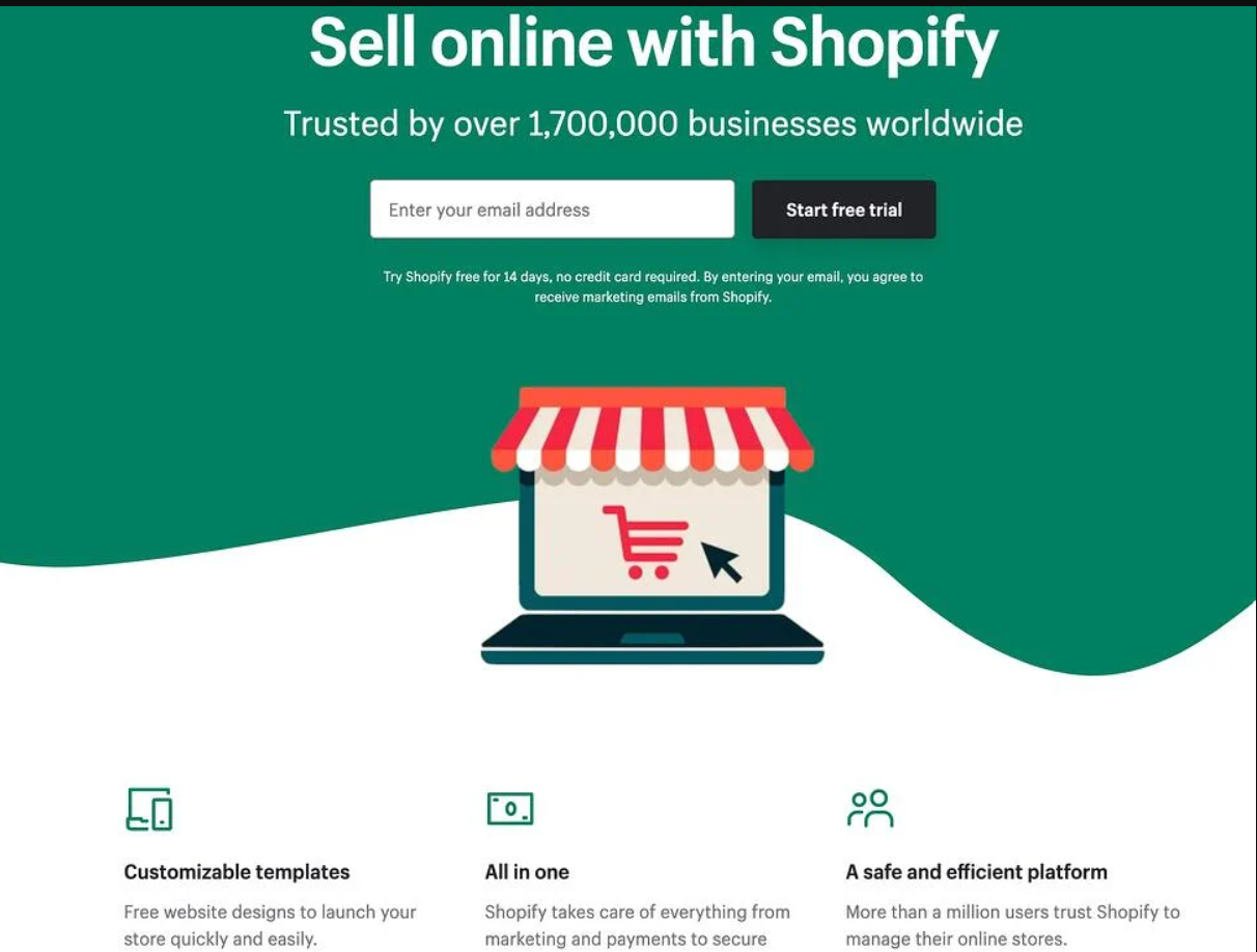
1) Shopify
- Clean UI
- Concise CTA
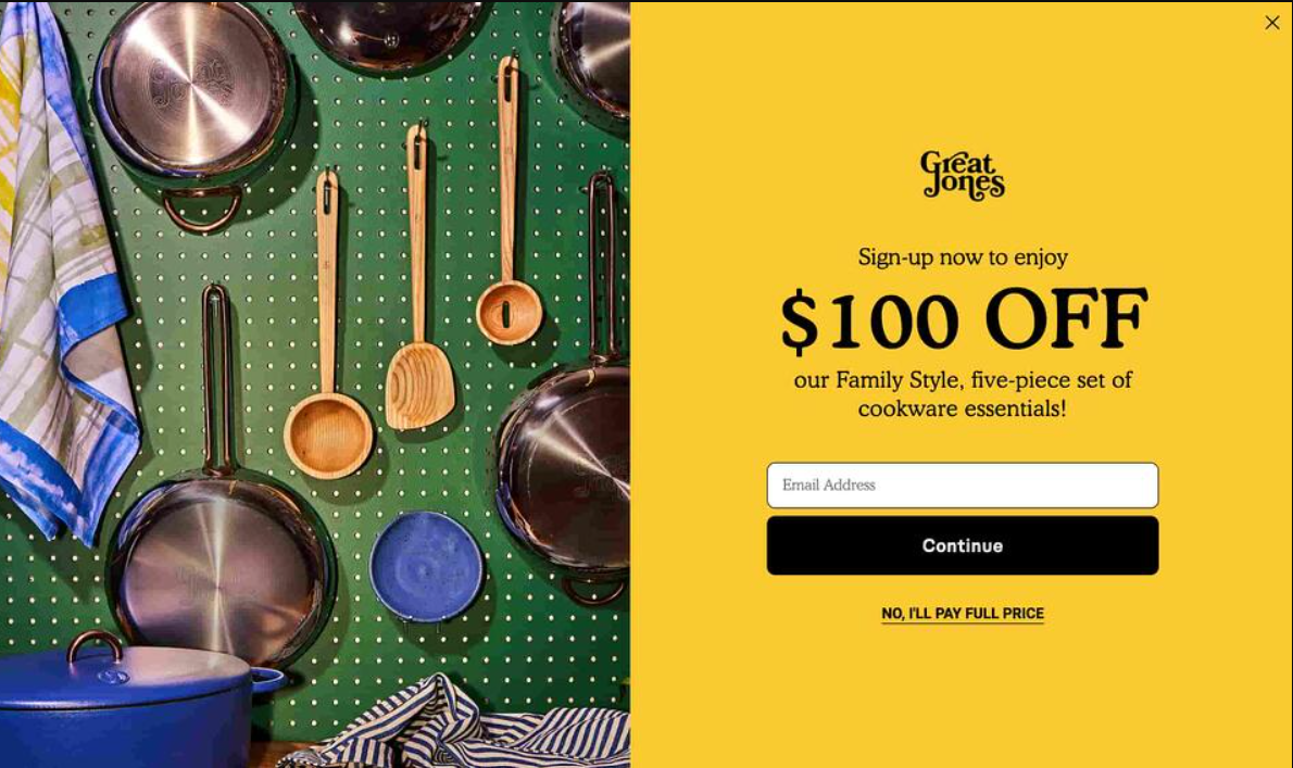
2) Great Jones
- Use of Color
- Prominent CTA
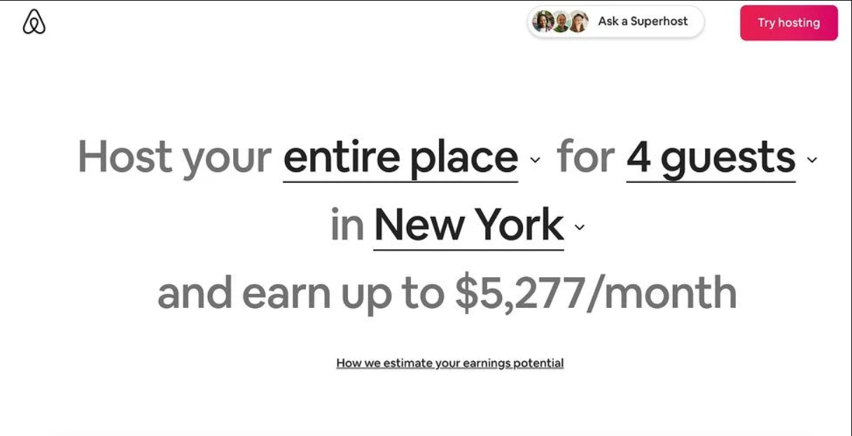
3) Airbnb
- Leverages community
- Personalization
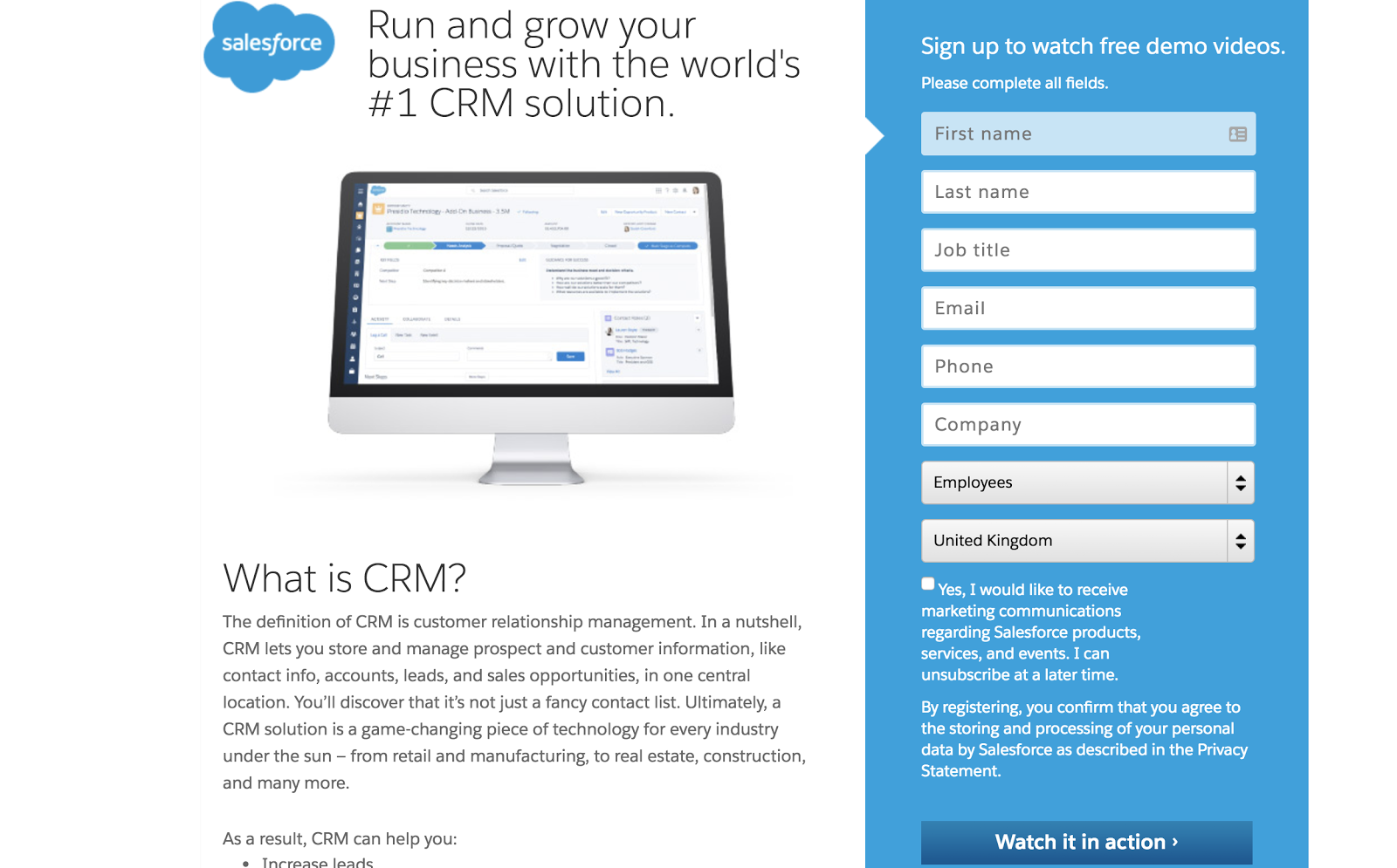
4) Salesforce
A clear headline and message.
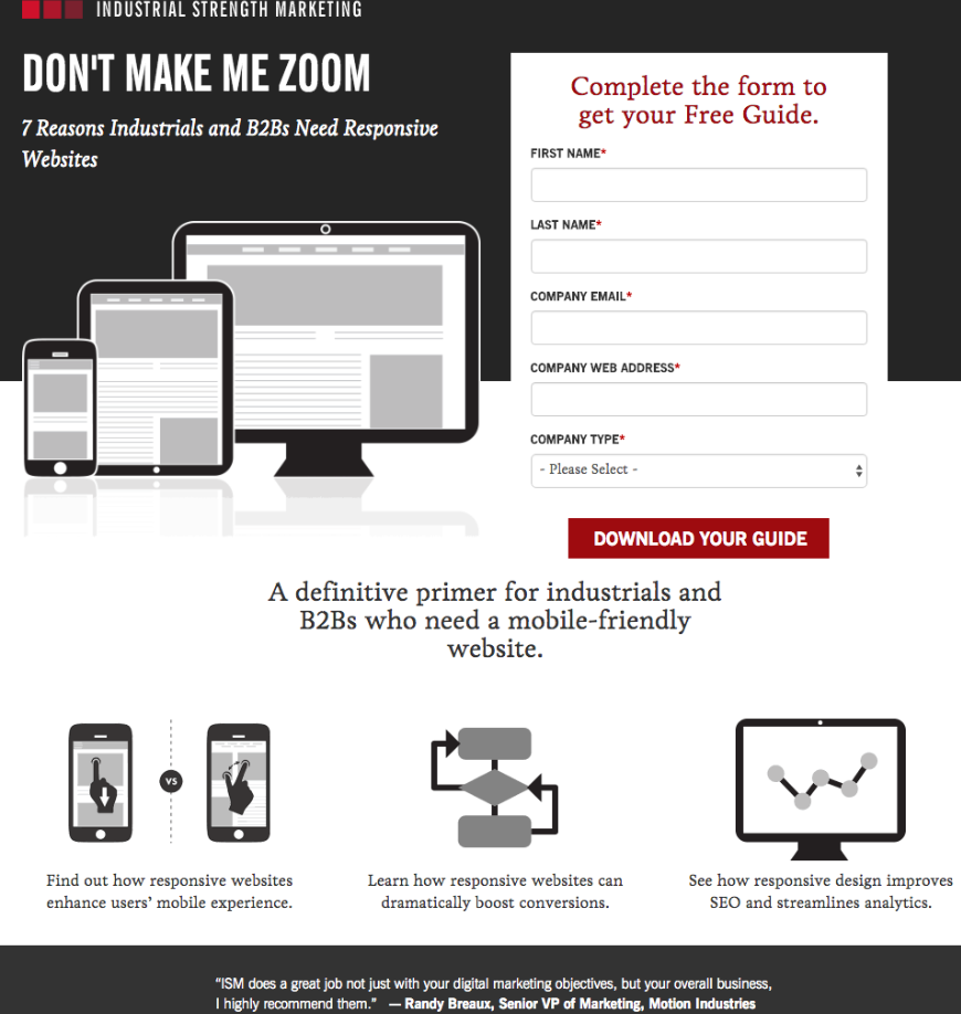
5) Industrial Strength Marketing
- Punchy & relatable voice
- Minimalist
In Conclusion…
Your landing page is the first impression for many of your prospective customers. So, seal the deal in the first go. After all, you only get one chance at first impressions.